ux/ui · digital humanities app · 2026
Echo
A portable research assistant for designers, artists, and humanities scholars to research and analyze the complex and contested cultural background of a visual concept, all in one integrated space rather than a dozen tabs spread out everywhere.
role
Solo Product Designer
project
Echo (Digital Humanities App)
platform
Mobile App
tools
Figma
Overview
Studies of visual culture through creative and humanities research are available on Pinterest, Google Image search, museum archives, Wikipedia, and JSTOR. These are all siloed resources that do not communicate with each other. They're excellent for telling us "what is this?" But they don't answer questions such as "where did this come from? What influenced its formation, and what has it influenced?" Today, we have to manually construct this history of influences using multiple iterations of a Google search.
The potential here lies in seeing visual research as the process of exploring influences, not simply retrieving information.
Primary users are undergraduate design, art history, and film students creating mood boards or papers, and emerging designers doing research for client projects. Their main requirement is credibility when working against a deadline: the ability to generate visually appealing material that can also hold up to a critique. Their main problem is that they don't know what they don't know: an art student researching Southern Gothic art will never discover the Gothic Revival architecture and colonial visual history that inform it, because no single tool makes that connection.
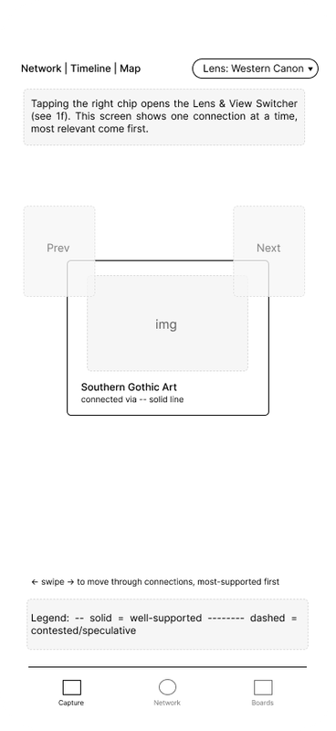
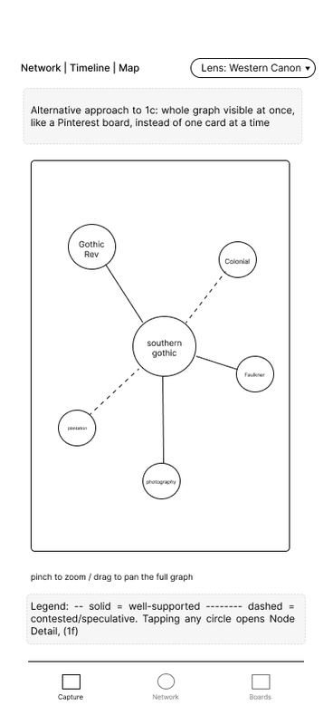
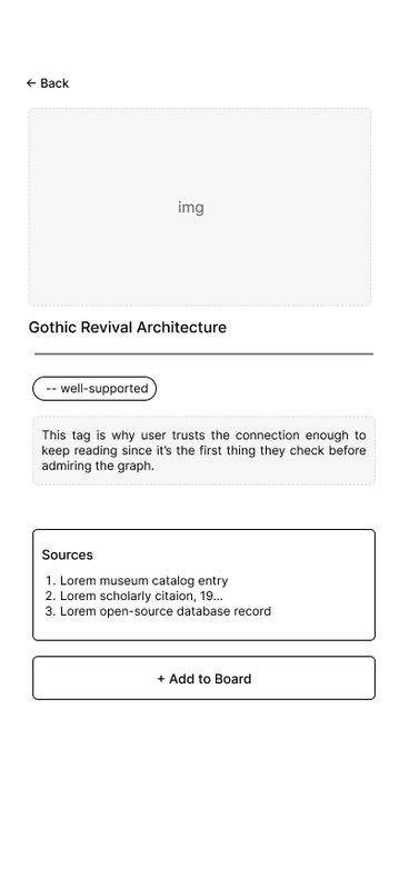
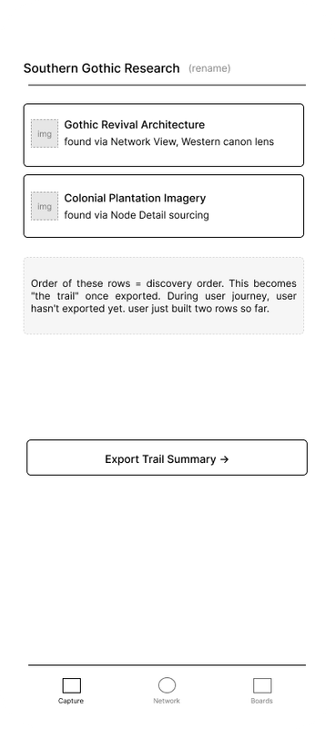
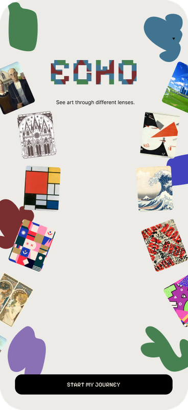
Users begin by taking a photo or uploading a screenshot, the core function, since no other tool performs it efficiently. Echo generates a connected network of linked backgrounds, artists, and artworks, where relations are shown with solid lines if they're well-supported and dashed lines if they're contested or speculative. A lens toggle lets you view that network from different interpretive perspectives: Western canon, Global South/decolonial, or contested; and a view switcher represents the same data on a timeline or map. Each node carries a sources card, and findings get saved to research boards that track how they were discovered, so a board can be exported as an annotated trail summary a student can actually cite in a paper.
Research
To ground the concept in something other than my own assumptions, I ran two short semi-structured interviews (~10 minutes each) with classmates about how they currently research the background of a visual reference, then walked each of them through Echo's core idea and asked for their honest reaction. I'm referring to them here as Participant A and Participant B, since I told both of them their names wouldn't be attached to anything shared publicly.
Their starting habits turned out to be nearly identical: open Pinterest or Google Images, search a loose style term, and stop once a couple of sources say roughly the same thing. Neither keeps written notes: Participant A screenshots everything into one phone folder and airdrops it over later; Participant B feeds a screenshot to ChatGPT to name the style first, then Googles that category. Both described a moment where they'd stumbled onto (or wished they'd found) a visual connection they never would have thought to search for on their own.
"I never would've connected those two on my own... I think people have interesting minds": Participant A, on noticing an accidental link between a traditional Korean pattern and Art Deco geometry in a comment section.
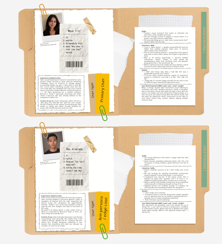
Where they split was trust. Participant A is vibes-based but still wants a paper trail, she'll believe a museum site or a brand explaining its own choices over "someone's opinion in the comments," and said she'd assume a tool "is guessing" if it didn't show where the info came from. Participant B was blunt that credibility isn't really his filter at all, "I don't really care, to be fair", and said he'd only trust or bother with a tool like this if it felt aimed at someone like him, not at design specialists.
That split is why the primary persona, Maya Ilić, is scoped fairly narrowly around Participant A's behavior: newer to art history, doesn't fact-check hard day to day, but does care whether a connection is sourced once she's asked to slow down and actually look at one. Participant B's reaction, indifferent to sourcing, worried the app "isn't for him," already patching the same gap with ChatGPT, became a second, secondary persona used mainly as a boundary: a reminder of who Echo is deliberately not designing for yet, rather than a second set of features to chase.
Maya needs a way to see sourced, credible connections between visual references so she can back her research with real context instead of relying on instinct and present work that reads as informed, not derivative.
Both were skeptical of the lens feature, though for different reasons. Maya's version of the concern was about being handed three interpretive framings before she even understands "the normal one", Participant A's literal feedback was "maybe if it started simple and then let me click to see it a different way, instead of throwing it all at once," which is directly why lens onboarding defaults to Western Canon with a Skip option instead of presenting all three lenses up front (see Process, 03).
Process
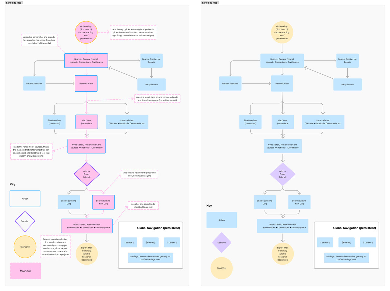
The starting point for the wireframes was the site map and Maya's user journey. Instead of treating every box on that map as its own screen, I asked which of Maya's actual behaviors needed an actual dedicated wireframe and which ones could be "folded" together.
01
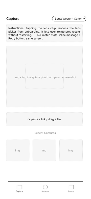
Capture is the home screen
Maya doesn't go looking for a research tool coldly: she opens Echo already having a screenshot she meant to use. Designing around that specific habit, instead of a generic "search first" pattern, is mostly what shaped the whole flow: Capture leads straight into Network View, and Network View leads straight into Node Detail, because the citation is the moment she actually decides whether to trust the app.
02
Two philosophies for Network View
The swipe-style, one-connection-at-a-time card is closer to a flashcard deck: low-commitment, doesn't ask the user to parse anything until they choose to. The full graph view is meant to feel more like a map: zoomable, all connections visible at once, more rewarding exploration than guiding it. I kept both because the swipe version fits Maya on a first visit, but a returning or more confident user might prefer the graph once they trust the sourcing.
03
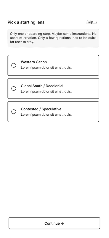
A default, skippable lens
I gave onboarding a Skip option and made Western Canon the loaded default. Participant A's feedback, that being shown all three interpretive lenses at once would be a lot before she even knows "the normal one", confirmed what I'd guessed from Maya's persona alone: new to art history, worried about being overwhelmed, better served by starting simple and opting into complexity later.
04
Timeline and Map folded into one switcher
Timeline View and Map View pull from the same underlying data as Network View, so treating them as tabs of one component felt closer to how they'd actually be built than pretending they're three unrelated pages, and it keeps the number of top-level views Maya has to understand at once smaller.
05
Minor states, annotated not wireframed
I didn't wireframe the empty-search or retry states individually because they're real states in the flow, but they're minor variations on Capture rather than a structurally different screen, so I annotated them instead of duplicating a wireframe for each.
What I'm least sure about going into final design is the "Add to Board" moment. Right now it's a low-effort, easy-to-dismiss toast, which I think is right for Maya's first session where she's not trying to export yet. But I don't know if that's still the right amount of friction once someone's on their fifth or sixth save and Boards starts needing real organization instead of a quiet confirmation.
Wireframes
.png)
.png)
.png)
.png)
Designs
‹
1 / 5
›
Brand
Echo's visual identity pairs Pixelify Sans for display type with Inter for body text, set on a two-color base: a warm cream and a muted stroke grey that carries hairlines, captions, and secondary text throughout the app.
Display — Pixelify Sans
Echo
Body — Inter
A visual research companion.
Cream
#F9F1E6
Stroke / Text
#A4A09A