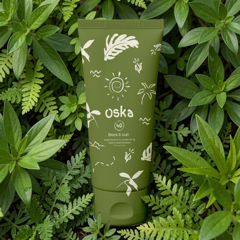
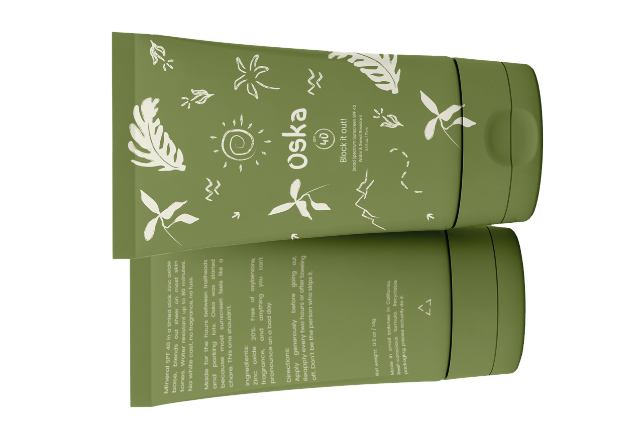
The product
made for the hours between trailheads and parking lots
The brief
Design packaging for a tinted mineral SPF 40 stick that lives in the outdoor gen-z enthusiast space: hikers, nature-forward, beach people. It needed to sit next to Vacation and Supergoop without looking like either. No gradients, no skin photography, no resort energy.
The mood reference: worn-in camp gear, old trail maps, the cardboard backing of a sketchbook.
The mood reference: worn-in camp gear, old trail maps, the cardboard backing of a sketchbook.
Design decisions
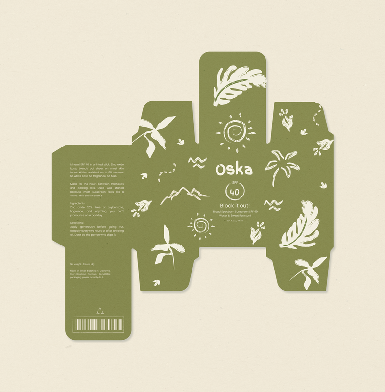
Two-color only
Olive on cream. No gradients. Forces every element to earn its place.
Hand-drawn illustration
Loose botanicals and mountain lines over polished icons. Fitting the very hands-on nature of the main customer.
"Block it out!"
The tagline does the job without being clever about it. Dry, direct, on-brand.
No white cast, no fuss
The copy matches the packaging energy: honest and a little blunt.
The pattern
illustrations that feel unearthed, not created
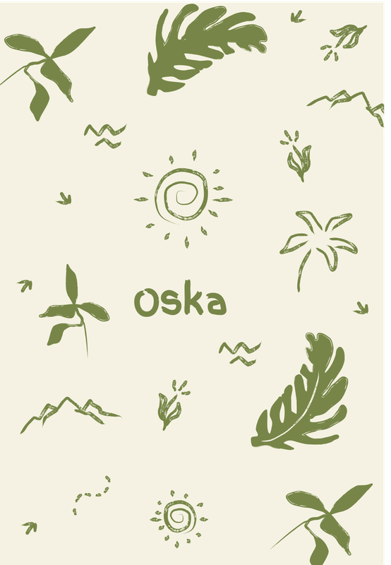
Botanical motifs
Loose, brushy leaves and fronds. Not too tropical, and not too clinical. Maybe somewhere between a field guide and a sketchbook.
Mountain lines
Added in v2, replacing too beach-y motifs. One swap and the whole territory shifted from resort to trail.
Negative space
The cream background does as much work as the illustration. What's not drawn is part of the structure.
Two colors only
Every element has to earn its place when you've got no gradients and no photography to lean on.
Back panel copy
sounds like a friend wrote it
The brief said no corny taglines, so I didn't write any. The back panel reads like someone who actually uses the product talking to someone who will. Dry, direct, a little self-aware.
PackagingTwo-color systemHand illustrationMineral SPFOutdoor brandFigmaIllustrator
oska
