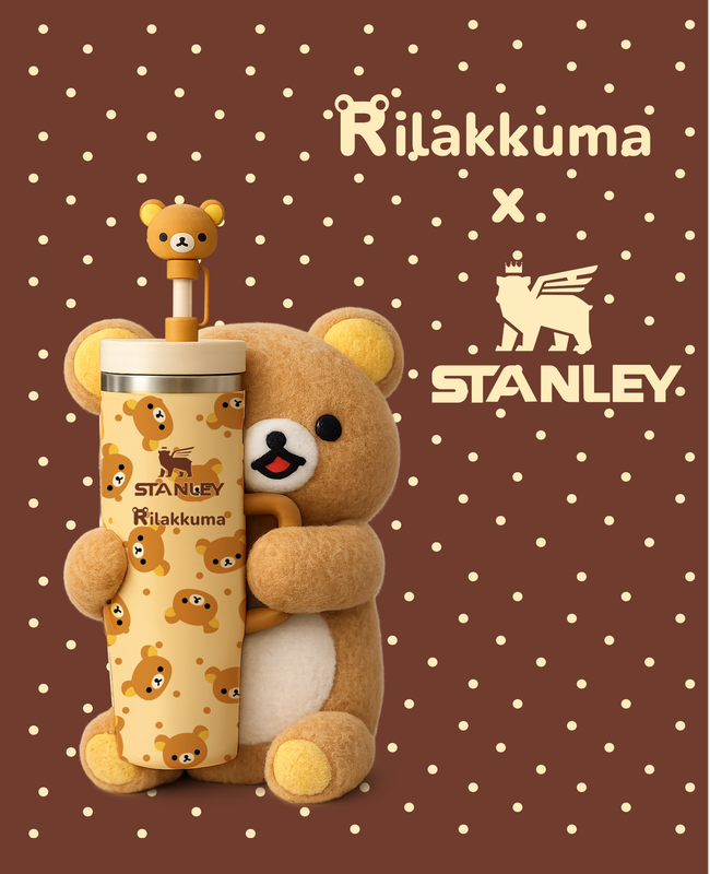
packaging design · brand collab · 2026
Rilakkuma × Stanley
A personal portfolio project reimagining a cobranded collection between Stanley's hydration culture and Rilakkuma's rest culture — self-care for both ends of the day, whether you're on the move or doing absolutely nothing.
Goal
Build a believable brand extension that captures Stanley's product language and Rilakkuma's emotional comfort language, without flattening either into the other
Use the tension between "rugged/active" and "soft/passive" as a deliberate design device rather than resolving it away
role
Solo Brand Designer
purpose
Personal Portfolio Piece
deliverables
Moodboard · Pattern · Charm · Packaging · Hero Shot
timeline
1-2 Weeks (2026)
Logo
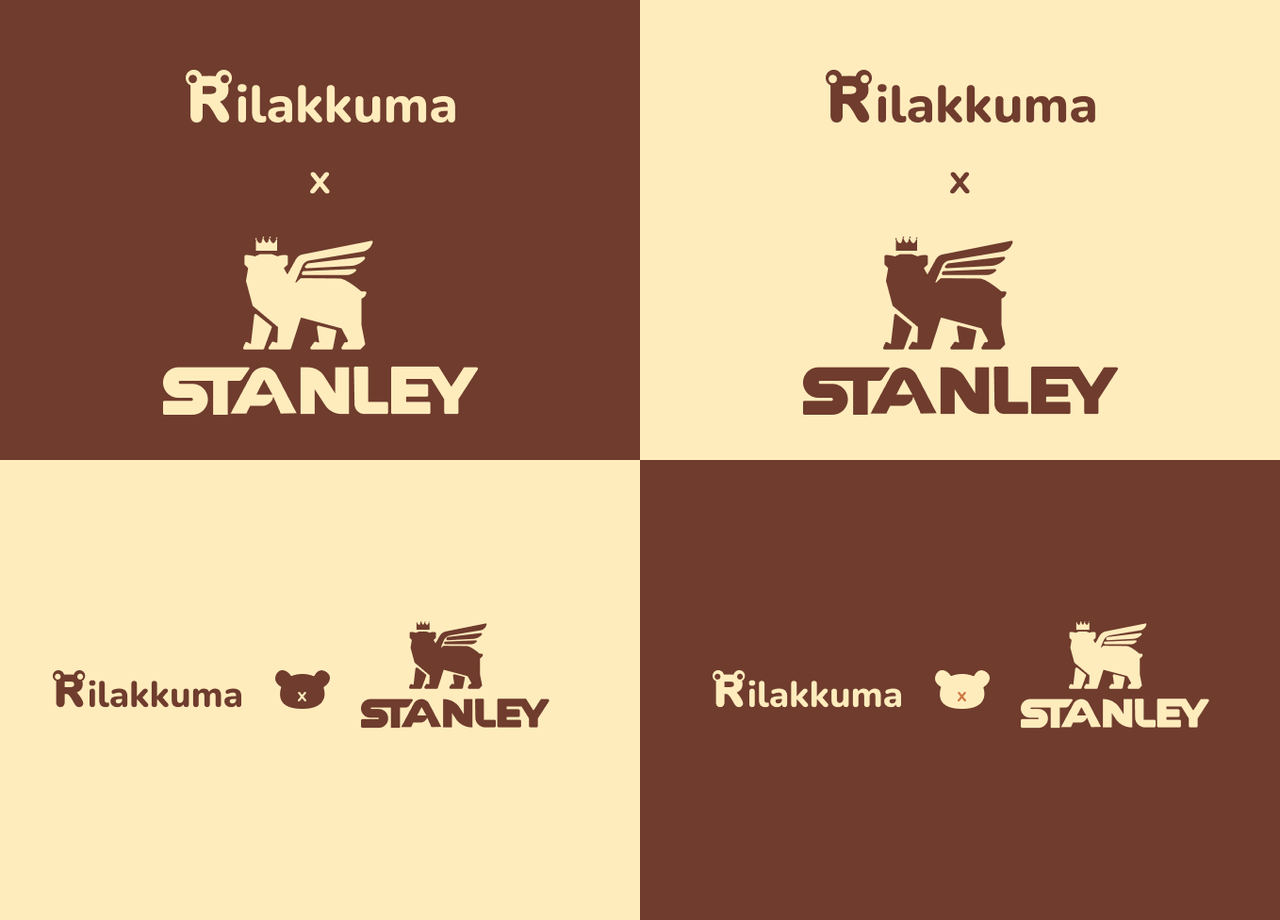
Behind the lockup
The lockup keeps both brand marks legible and equally weighted — Stanley's bold, condensed wordmark paired with Rilakkuma's soft rounded type — separated by a small "×" so it reads as a genuine collaboration rather than one brand hosting the other.
Moodboard
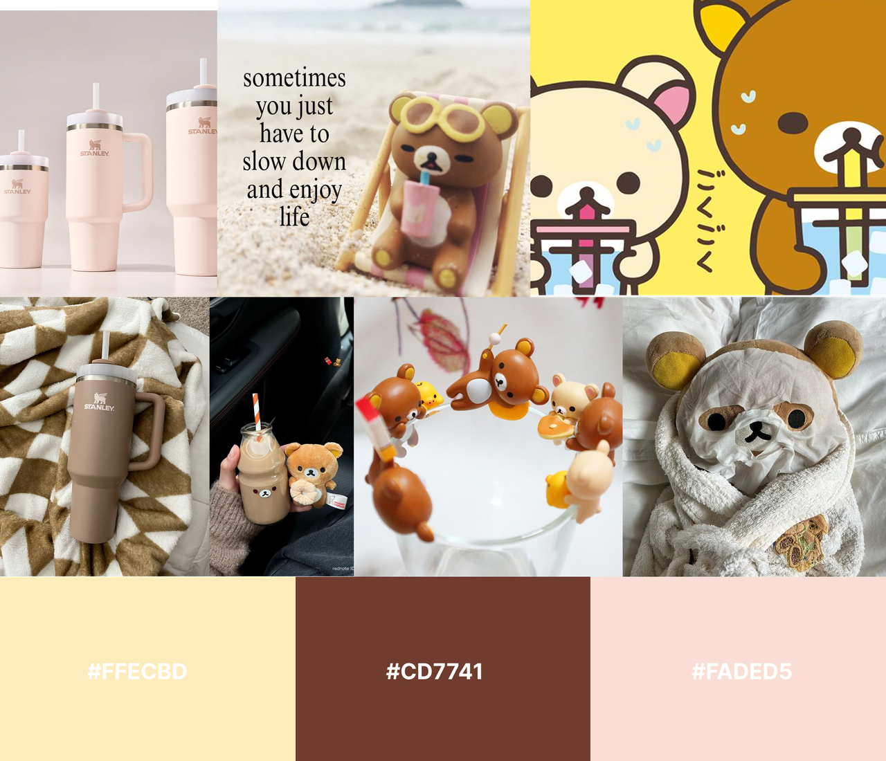
Where the two worlds overlap
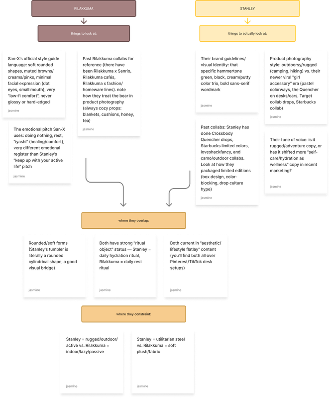
Stanley's rugged hydration ritual and Rilakkuma's soft, do-nothing comfort ritual don't look alike at first: one's steel and motion, the other's plush and stillness. But both live in the same warm neutral palette, and both show up constantly in the same cozy lifestyle content. That shared "lounge" feeling was what started this idea.
Research
Overlap vs. constraint
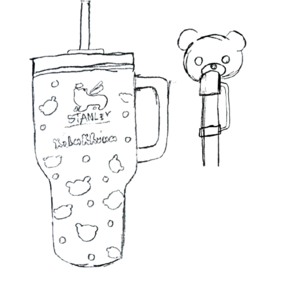
Rather than blending both brands into one generic aesthetic, I mapped what they genuinely share (rounded forms, ritual object status, lifestyle-flatlay presence) against what keeps them distinct (rugged/active vs. soft/passive, steel vs. plush), and I also researched other brand collabs Stanley has done tailord for a more softer audience. Before any of the pattern or packaging work began, I sketched out some ideas.
Palette
Honey Cream
#FFECBD
Warmth · Softness · Base
Rilakkuma Rust
#CD7741
Cozy · Grounded · Accent
Dusty Blush
#FADED5
Gentle · Playful · Highlight
Text & Background
#5C3A28
BG
#FAF3E5
Pattern & Illustration
Sketch → Final
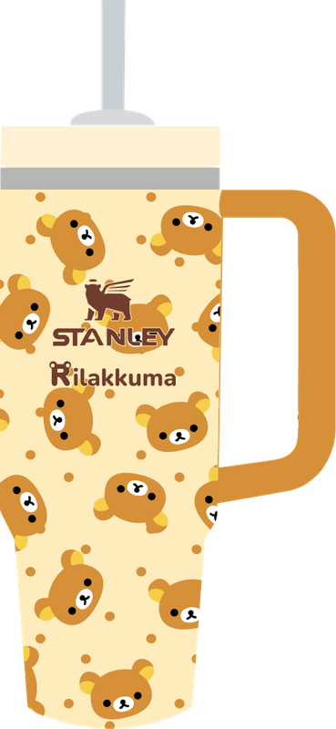

Behind the pattern
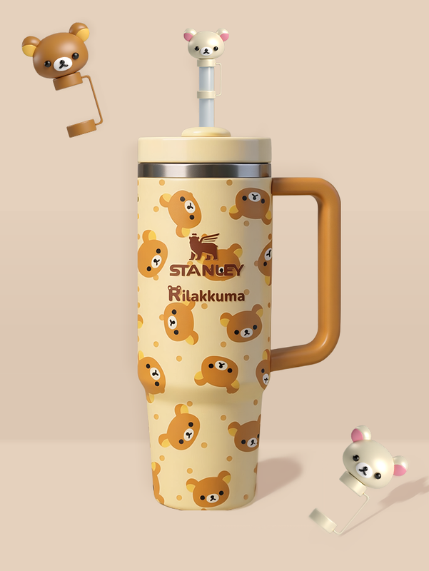
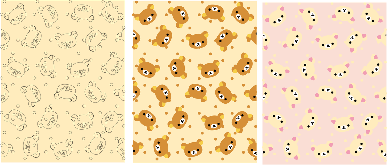
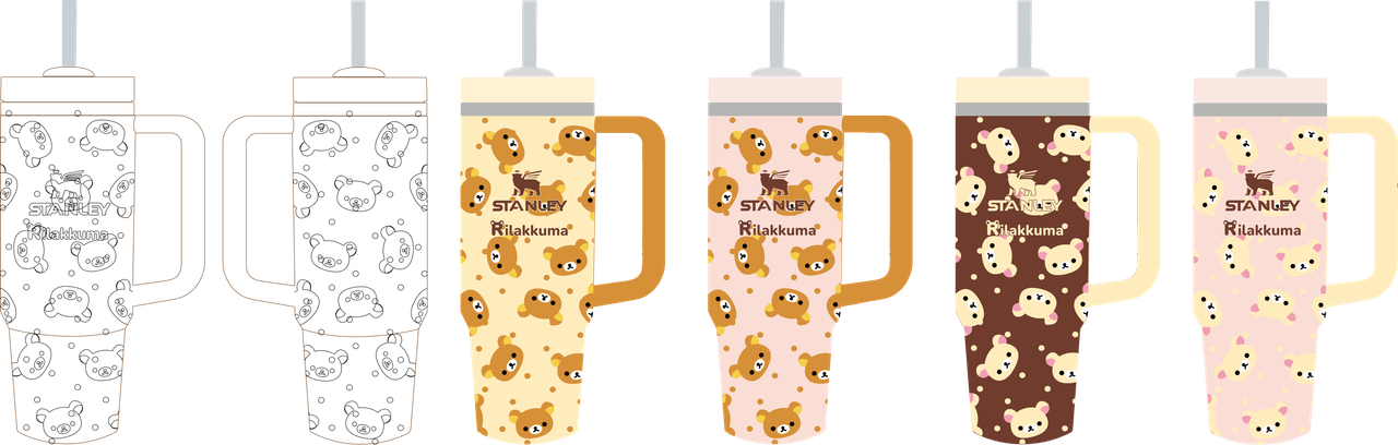
The bear-face motif was built as a repeatable, tileable print, I sketched out the main draft and then included colorway so it could wrap cleanly around a curved tumbler surface without distortion at the seams. Density was kept deliberately calm (soft dot fill, evenly spaced faces) so it reads as "cozy," not "busy," even at small scale.
Charm Design
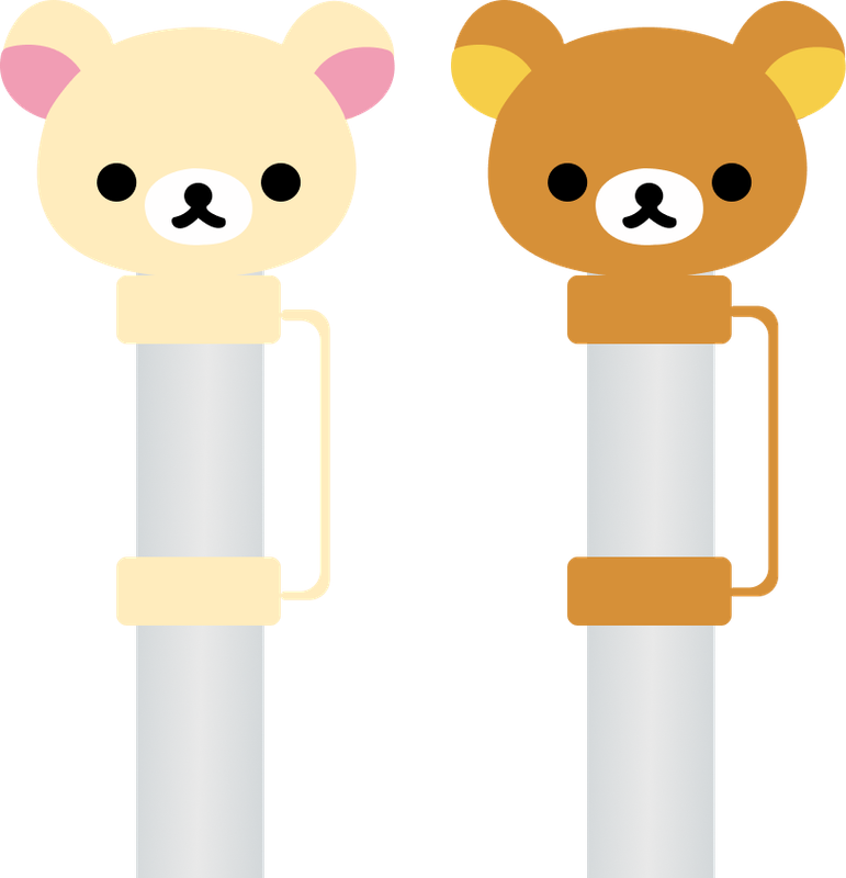
A figurine, reimagined for drinkware
Stanley has a straw. The topper became the natural stand-in for a "collectible" piece: a bear head that clips onto the straw, in both classic brown and a soft cream Korilakkuma-style variant, so the collectible moment lives right on the object people already customize.
Packaging
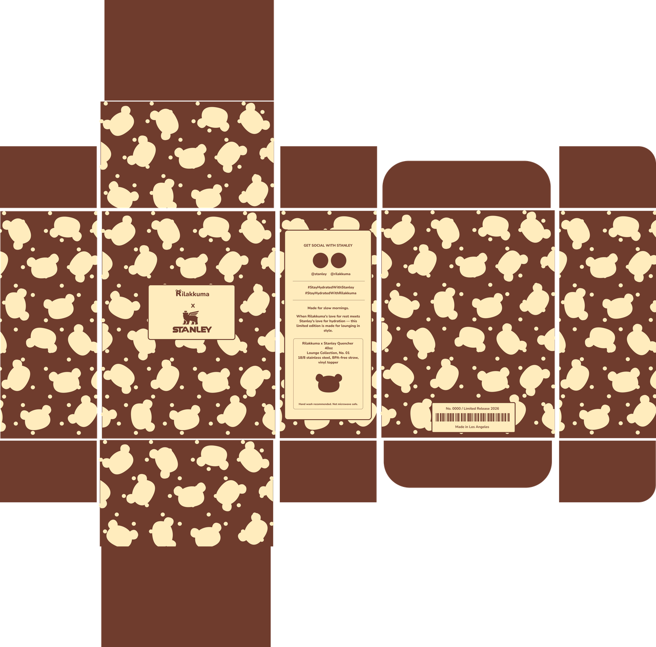
Dieline
Final Mockup
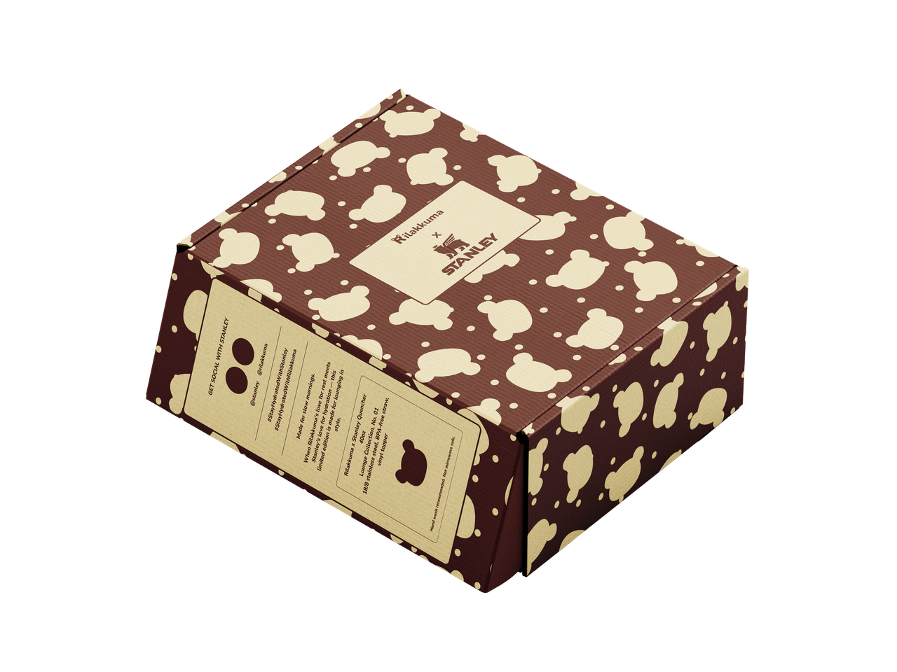
Behind the box
I included the info pannel for informational weight, like social handles, product specs, materials, and care instructions, while the cobranded lockup panel stays clean and quiet. A limited-edition stamp, barcode, and "Made in Los Angeles" line on the base panel push the whole thing toward feeling shelf-ready and to make it seem real!