branding · brand identity · 2025
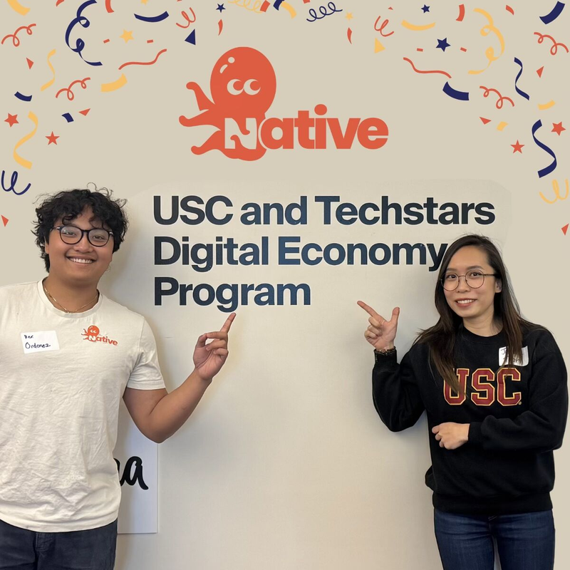
Native
As founding product designer & brand strategist, I built Native's full visual identity from scratch — logo, color system, typography, mascot, and all brand applications.
role
Founding Designer
scope
Full Brand Identity
deliverables
Logo · Colors · Type · Mascot · Applications
tools
Figma · Illustrator
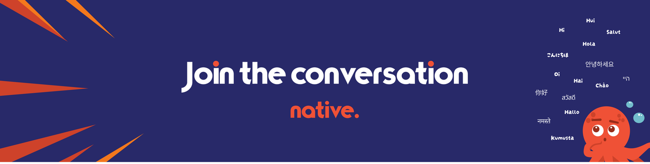
Logo
Behind the logo
Honestly, we went through a lot. Birds felt too obvious, every language app has a bird. Chameleons were on the table for like a week. We even tried a fox. Nothing stuck.
But the octopus made sense. Eight arms felt right for something multilingual; like it could hold a conversation in eight languages at once. It's weird enough to be memorable, soft enough to not be scary. Octo ended up being the whole personality of the brand in one drawing.
The logotype went through just as many rounds. We wanted something that felt handmade but not sloppy, bold but not aggressive. The final version has this slight wobble to it, each letter feels like it's mid-thought. I believe that felt honest for what Native is trying to do.
Colors
Primary Red
#EF5136
Energy · Confidence · Attention
Navy
#282969
Trust · Authority · Stability
Accent Orange
#F4781D
Warmth · Friendliness · Energy
Tone 1
#FEB622
Tone 2
#FEB218
Tone 3
#F89421
Text
#2D2D2D
BG
#F7F7F7
Type
Aa
Inter
Primary typeface
abcdefghijklmnopqrstuvwxyz
ABCDEFGHIJKLMNOPQRSTUVWXYZ
0123456789 !@#$%&
ABCDEFGHIJKLMNOPQRSTUVWXYZ
0123456789 !@#$%&
Light
captions, fine print
Regular
body copy, descriptions
Medium
labels, ui elements
Bold
subheadings, emphasis
Black
titles, display
Mascot

bold red
= confidence
= confidence
big eyes
= no judgment
= no judgment
smile
= happy to help
= happy to help
round shape
= approachable
= approachable
tentacles
= multilingual
= multilingual
Behind the mascot
Octo started as a placeholder. We needed something to fill the empty space next to the logo and threw in a sketch of an octopus as a joke. It stayed.
The more we worked with it, the more it fit. A webapp for language learning needs to feel safe — like there's no wrong answer, no judgment for mispronouncing something. Octo communicates that immediately. It's not a polished corporate mascot. It's a little chaotic, a little expressive, and genuinely happy to be there.
For the webapp specifically, Octo shows up in onboarding, in empty states, and during practice sessions. It reacts. It celebrates. It doesn't make you feel bad for getting something wrong. That was the whole point — design a character that makes the hardest part of learning a language (embarrassment) feel less scary.